
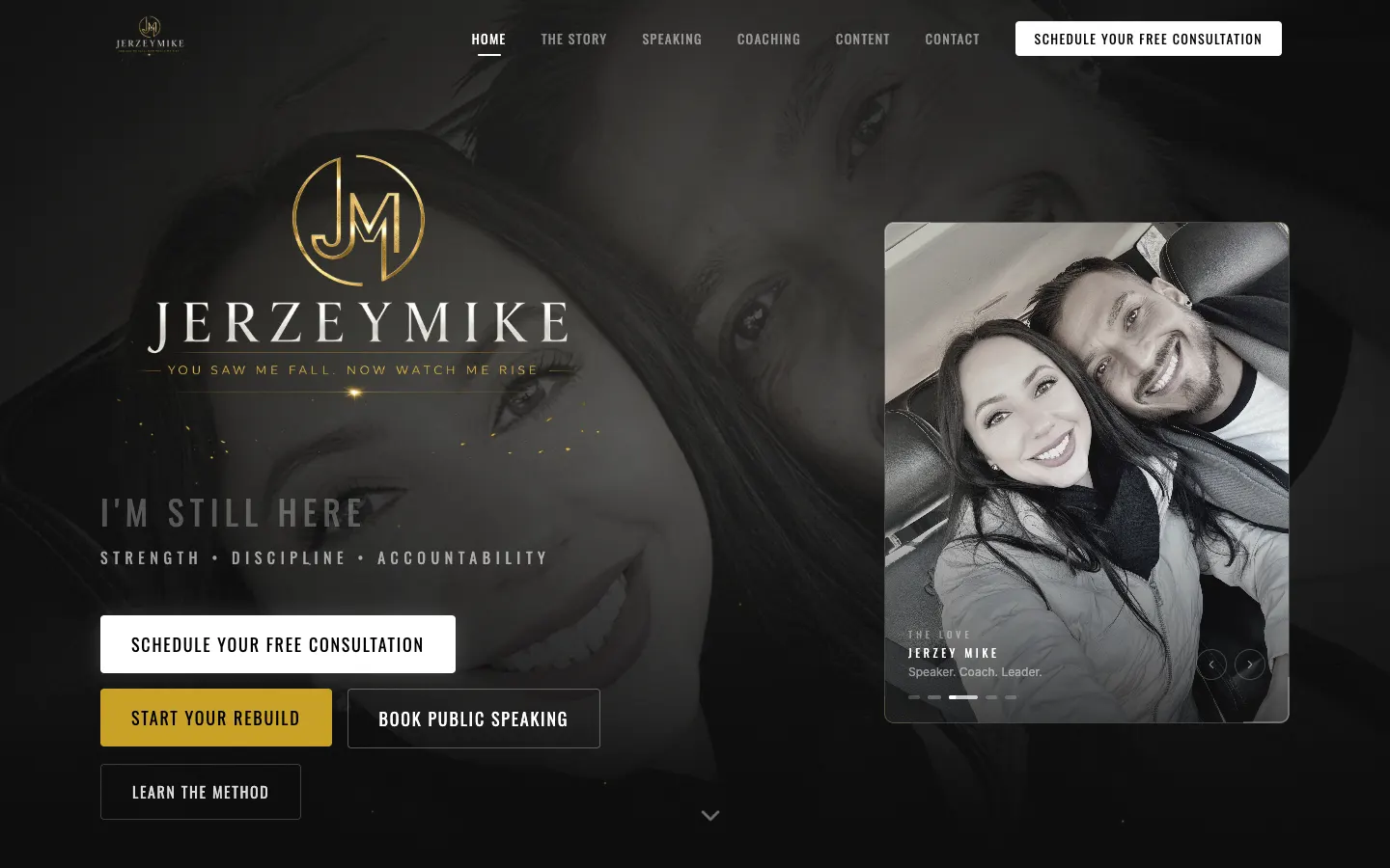
From the bottom to the stage,
one scroll down.
Jerzey Mike went from addiction and a coma to discipline, faith and a microphone. His site had one job: tell that story straight and make it easy to book him. No fluff, no stock smiles.
- 1page, one story
- 3ways to work with Mike
- 2brand colors: black + gold
A comeback story deserves more than a template.
Mike speaks for corporate rooms, recovery centers, faith communities and leadership events. He coaches people who are done making excuses. That is a lot of audiences for one guy, and a generic speaker template would have sanded off the exact edge that makes him worth booking.
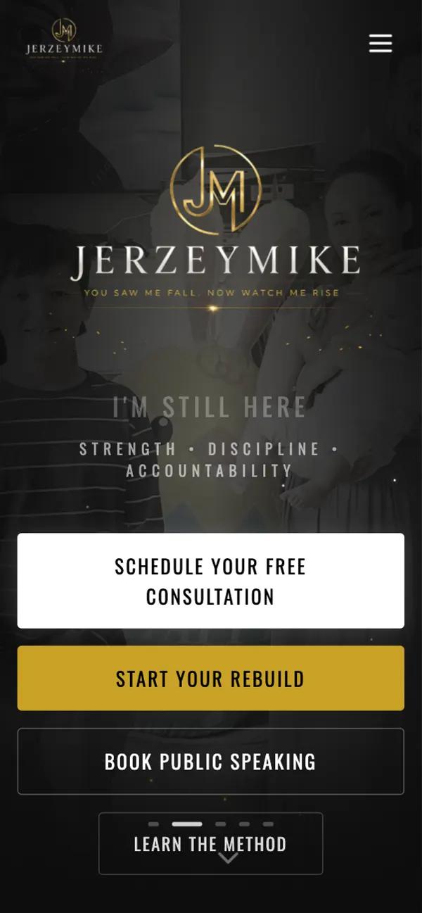
So the site leads with grit. Strength, discipline, accountability, right up top in gold on black, and the copy stays in his voice: lived experience, no textbook answers.
“If the person's real, the site has to be real. I'd rather it feel like a gym than a brochure.”
What it is, in one line: a one-page speaker and coaching site that walks from Mike's story straight to a free consultation.
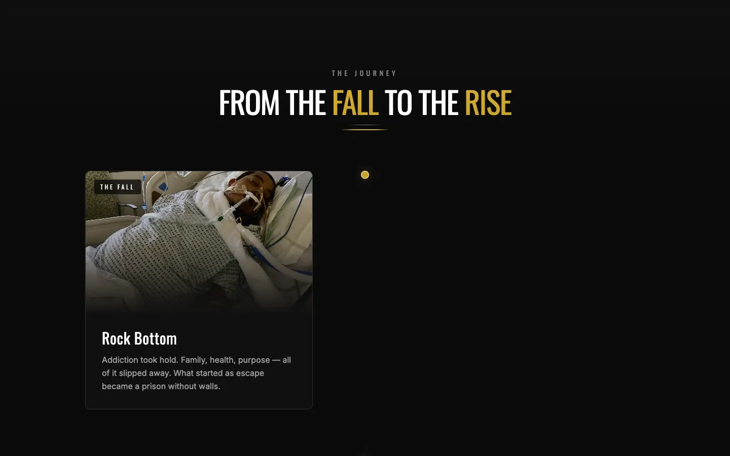
Let the hard part lead the way.
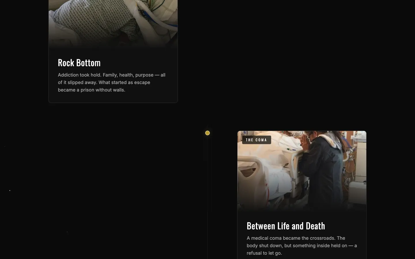
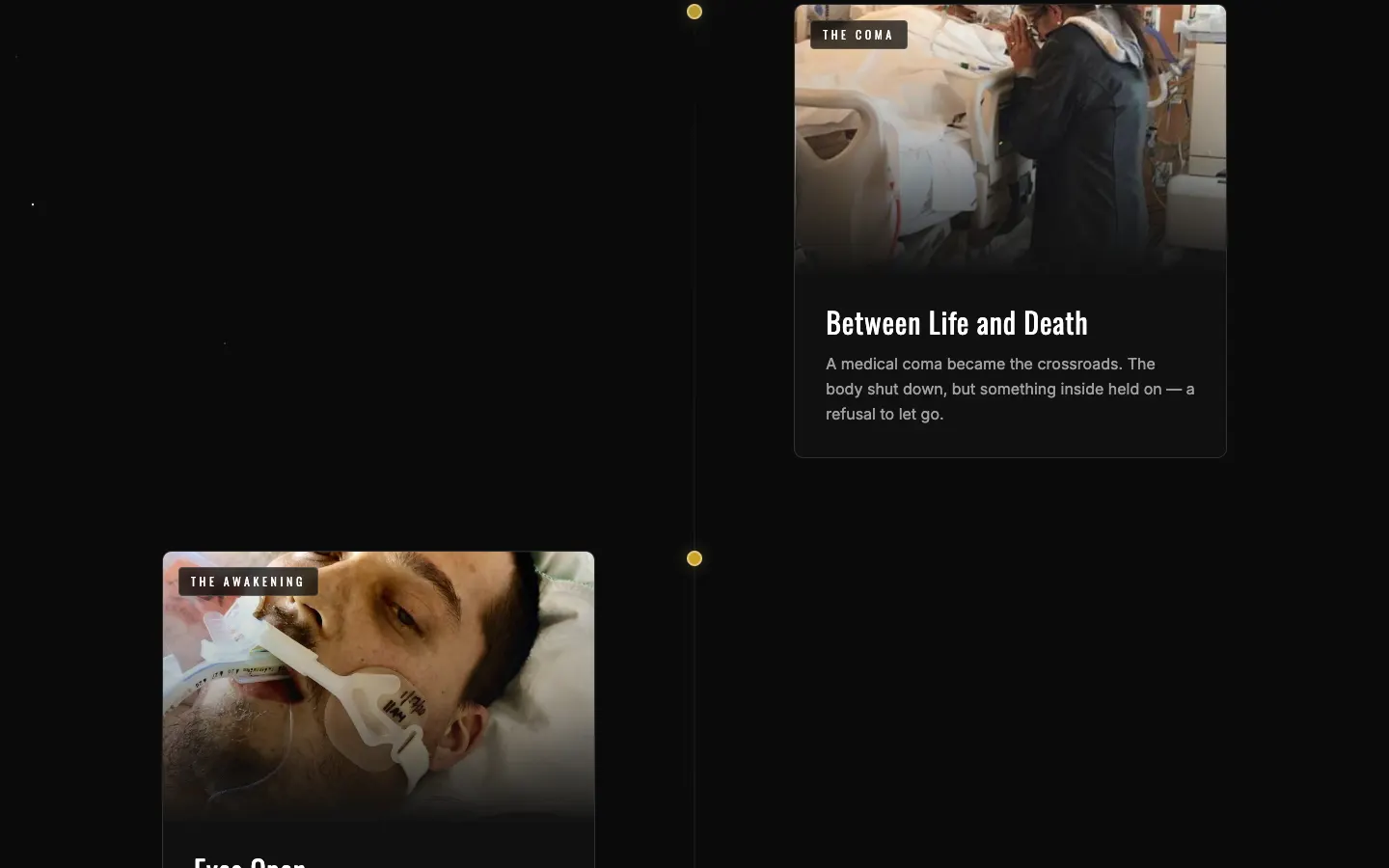
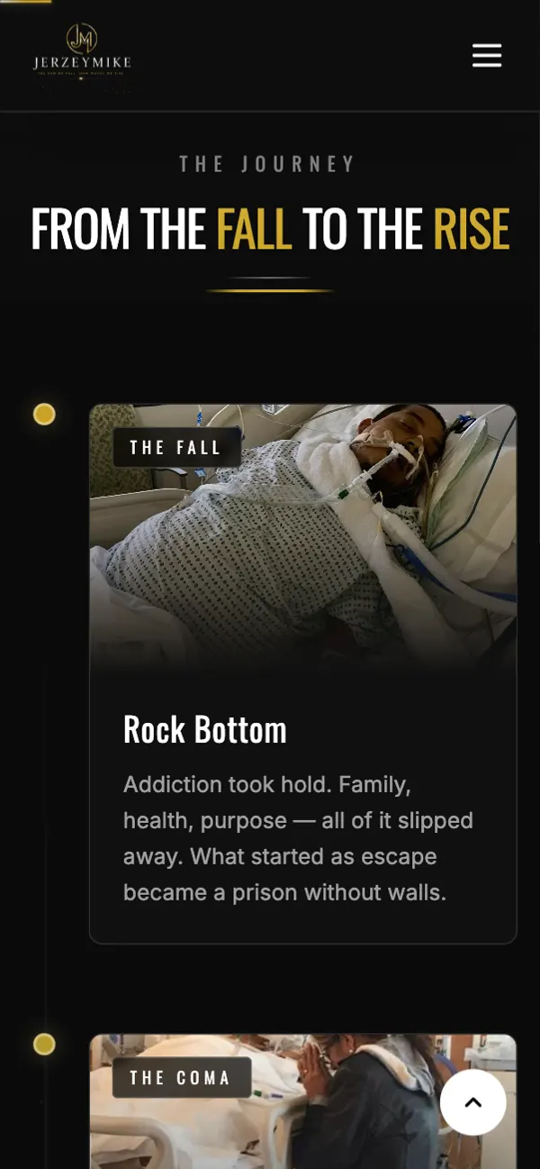
Most speaker sites bury the backstory under a logo wall. Mike's story is the product, so it gets the room: the honest account of a man who hit bottom and rebuilt through discipline, faith and accountability.
Speaking and coaching sit right after it, each written so a booker or someone in recovery can see themselves in it fast.
- Story-first layout
- Speaking section for every room type
- Sober coaching section
- Media and interview section
- Free consultation call-to-action
No algorithms, no gatekeepers
The contact section reads like Mike talking: reach out directly, whether you need a speaker, a coach or just someone who gets it.
Build the armor piece by piece.
I didn't want the page to only be read. There's a little interactive forge: drag or tap pieces of armor to lock them in, which is basically his whole message turned into a game.
It's a small thing. It's also the thing people remember.
- Drag-or-tap armor forge
- Gold-on-black type system
- Motion on scroll
- Social links to keep the rebuild going
Most people find him on their phone.
A lot of Mike's people come from social, so the mobile version is the main version. Big gold buttons, short sections and the free consultation never more than a thumb away.
The stuff you don’t see (but would miss).
Search basics
Unique title and meta description built around speaker, sober coach and transformation leader.
Share cards
Open Graph tags so a shared link shows his tagline instead of a blank box.
Fast single page
A lightweight React build with one stylesheet and one script.
Readable contrast
Gold on near-black, checked so it stays legible in bright sun.
Interactive forge
Works with drag on desktop and a simple tap on phones.
Direct contact
Email and consultation links go straight to Mike, no middleman.
Before you ask me.
Can a speaker site work as one page?
Yes. When the story, the offers and the contact path are in a clear order, one scroll does the job and nothing gets lost in menus.
What should a coaching site lead with?
Lead with why people trust you. For Mike that's his own comeback, so it comes before the services.
Do interactive bits slow a site down?
Not when they're small and built in. The armor forge is part of the page, not a heavy plugin.
Can I update my speaking topics later?
Yes. Sections are built so new talks, interviews or media can be added without a redesign.
Got a story people need to hear? Let's build its home.
If your work is personal, your site should be too. Tell me about it and I'll make it sound like you.