The system shouldn't feel like
a second job.
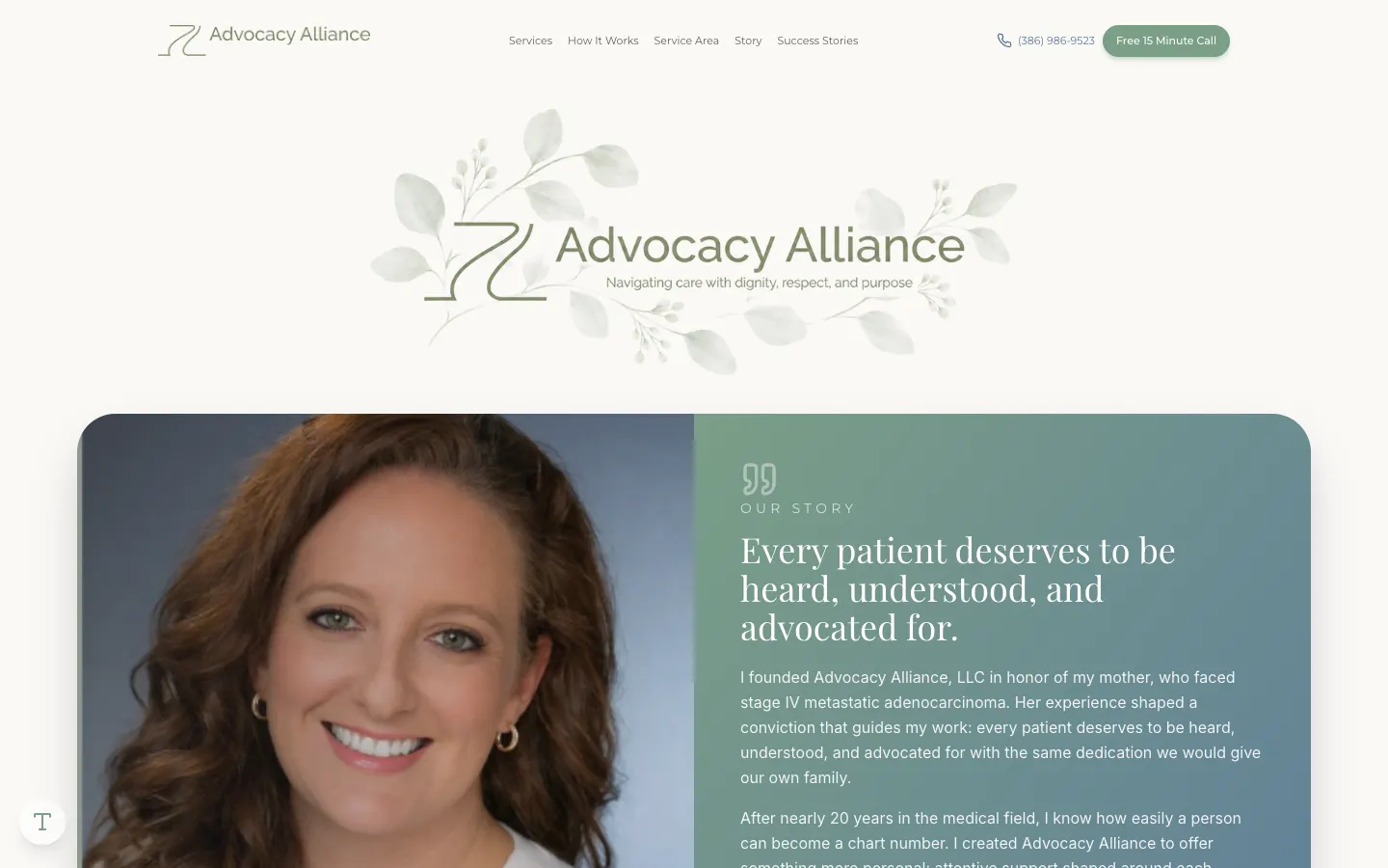
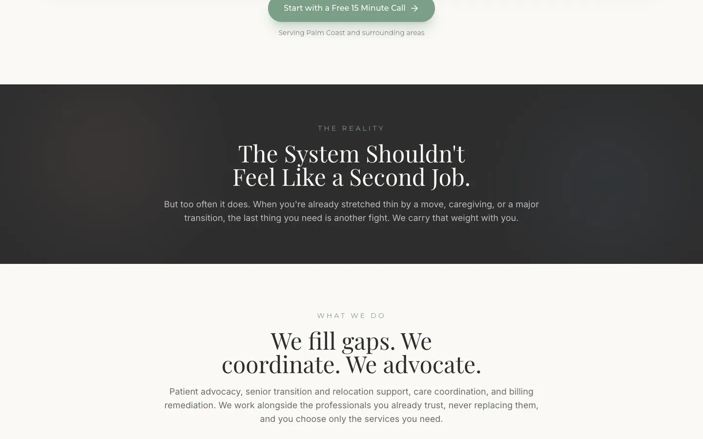
Advocacy Alliance helps people through patient advocacy, senior transitions, care coordination and billing problems in Palm Coast and nearby. Anyone landing here is already overwhelmed. The site had to feel like an exhale.
- 4service areas
- 1question to find your help
- 24 hrresponse promise
Stressed people don't read. They need a hand.
When you're dealing with a denied claim or moving a parent, a wall of service descriptions is one more chore. So the site asks one question, what brings you here today, and points people to the right kind of support.
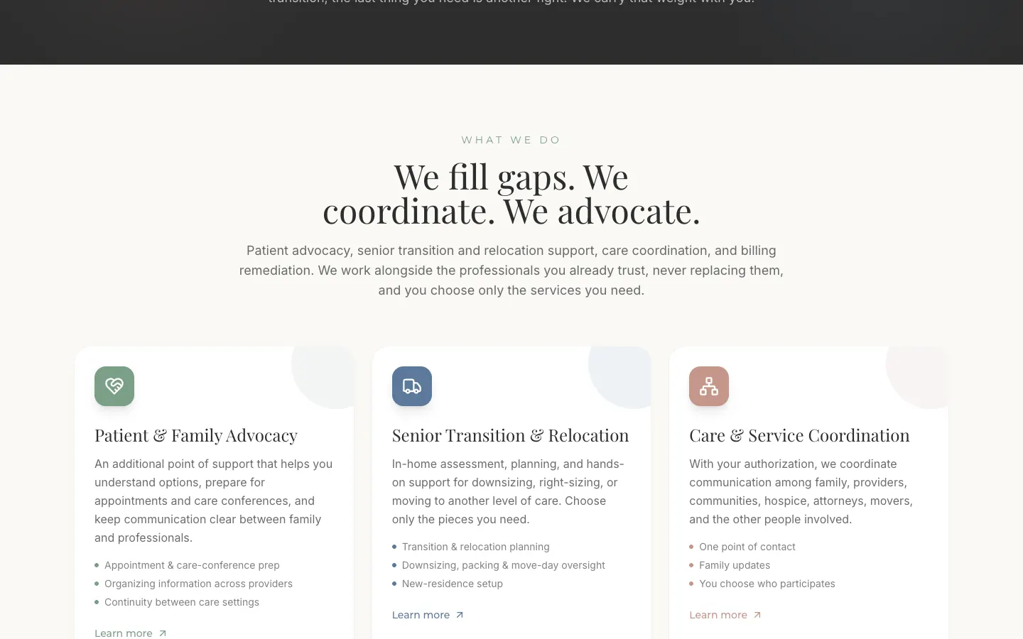
The look is soft sage and dusty rose with a botanical logo. Calm on purpose.
“For a site like this, the best design is the one that makes your shoulders drop.”
What it is, in one line: a gentle advocacy site with a one-question guide, a founder story and a no-pressure contact form.
Answer one question. Get pointed right.
Instead of making people sort themselves into services, the page asks what they're facing and routes them to the right help, with a 'talk to an advocate about this' button right there.
It turns a confusing menu into a short conversation.
- One-question support finder
- Talk-to-an-advocate buttons
- Services in plain words
- Works alongside existing providers
No pressure, no judgment
The contact form asks what's going on, keeps the details optional and promises a reply within 24 hours by call, text or email.
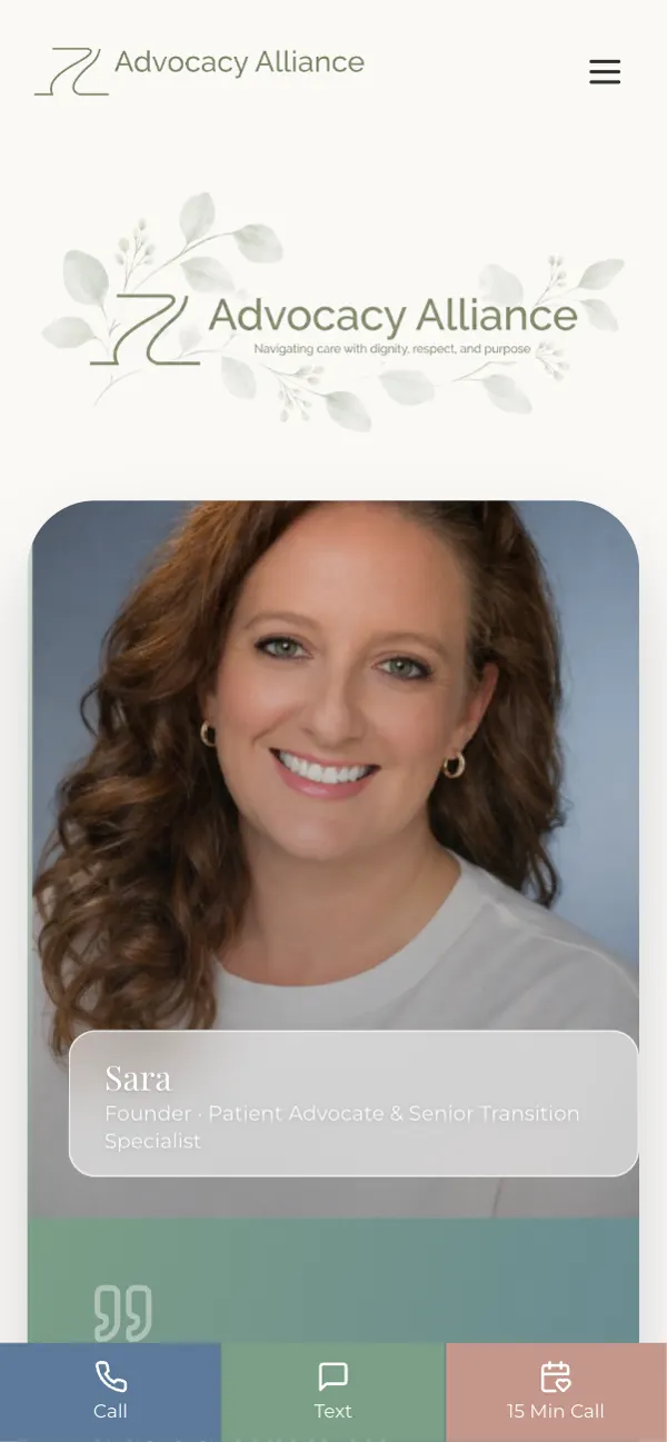
Lead with the person, not the logo.
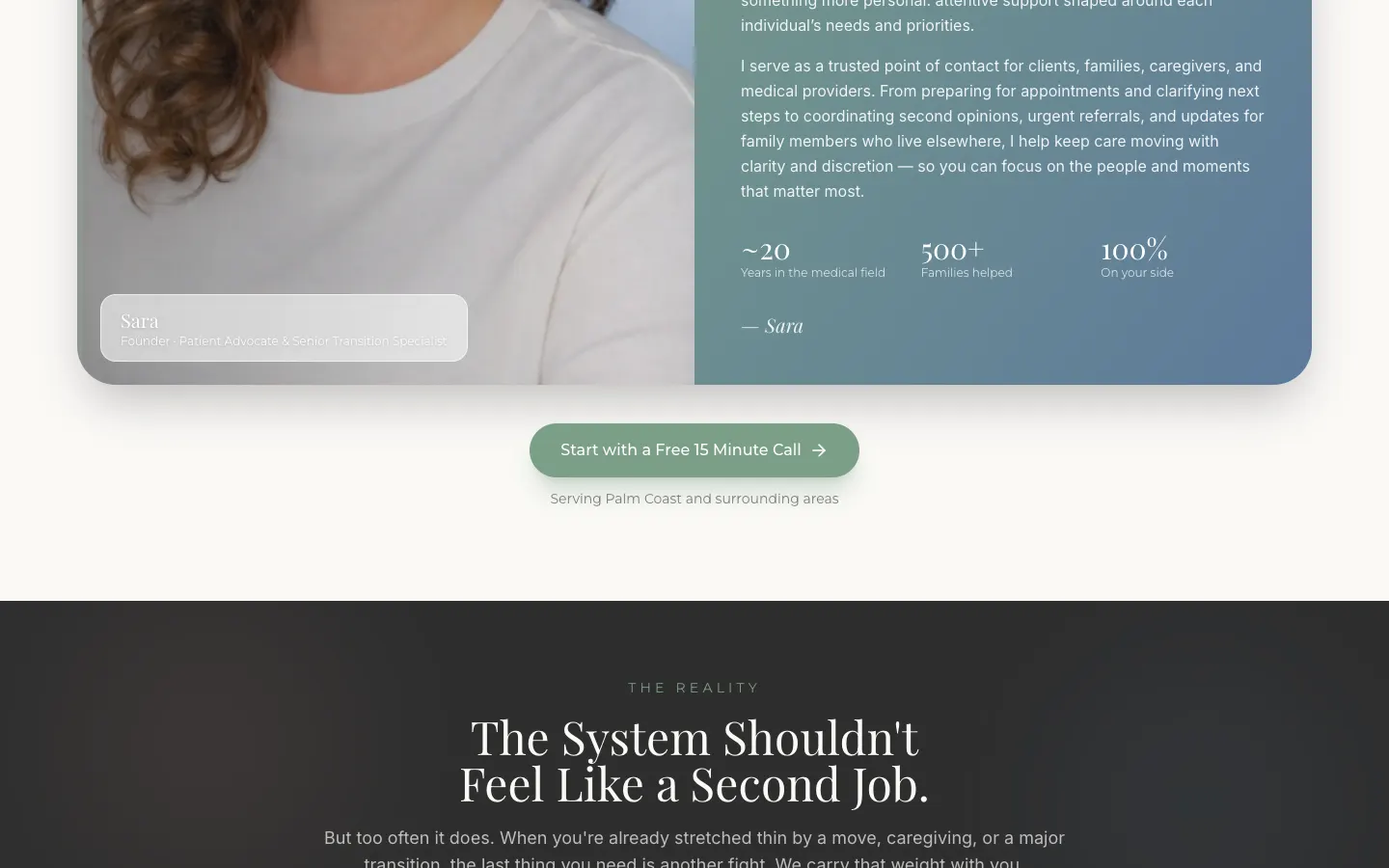
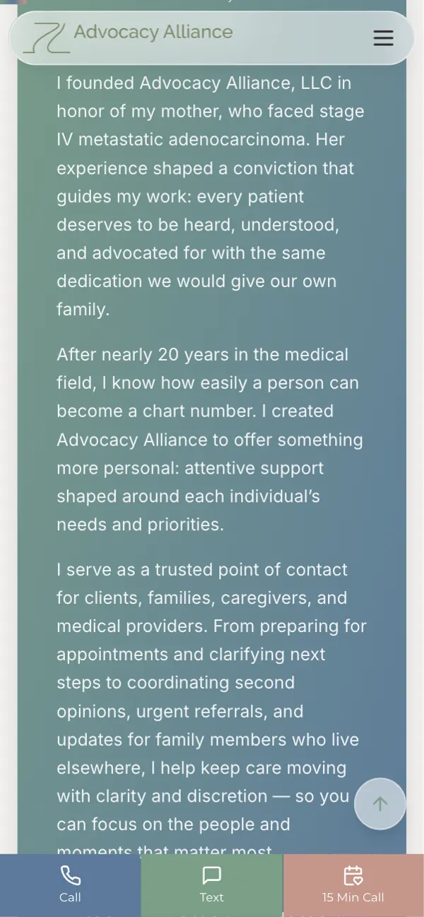
The founder's story sits near the top: nearly 20 years in the medical field and a belief that every patient deserves to be heard. People choose advocates they trust, so that comes first.
Before-and-after stories show the kind of situations the team helps untangle.
- Our Story near the top
- Founder section
- Before and after stories
- Newsletter for guides
Help often gets searched from a waiting room.
People look for advocates in hospital hallways and parking lots. The phone layout keeps the guide question, call button and form simple and large.
The stuff you don’t see (but would miss).
Clear meta
Title and description name every service and Palm Coast.
Schema
Two blocks of structured data so search engines understand the business.
Share cards
Open Graph tags with a calm, on-brand preview.
Accessible type
Soft colors chosen with readable contrast.
Contact form
Optional details and multiple reply options.
Newsletter signup
A simple way to get guides and support updates.
Before you ask me.
What should a patient advocacy website include?
Clear services, who you help, the founder's background and a gentle, simple way to reach out.
How do you design for stressed visitors?
Fewer choices, calm colors and a guided first step. Advocacy Alliance asks just one question.
Should I share my personal story on my site?
If it's why you do the work, yes. People choose advocates they trust.
Can a small practice have a newsletter?
Yes. A short signup for guides keeps people connected without being pushy.
Your work helps people. Your site should too.
If you do caring work, let's build a site that feels as kind as you are.