Five letters, one clear message.
Easy to follow.
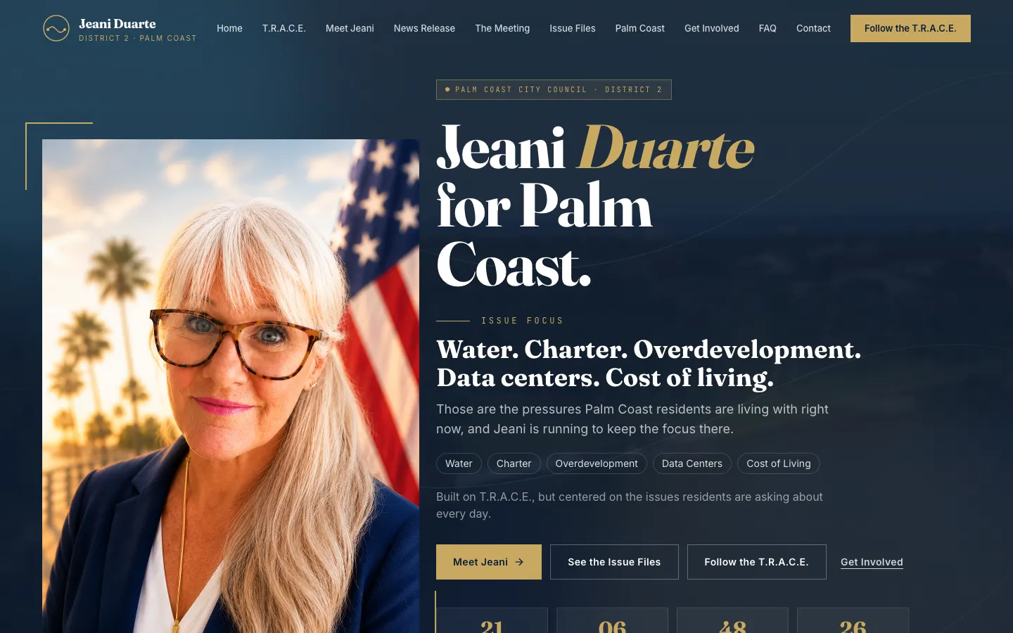
Jeani Duarte ran for Palm Coast City Council, District 2, around a five-value framework called T.R.A.C.E. My job was the build: make the message easy to read, easy to share and easy to act on, especially on a phone.
- 5values in T.R.A.C.E.
- 2election dates on the page
- 1tap to volunteer
Local campaigns need clarity over noise.
Neighbors check out a local candidate in a couple of minutes, usually on their phone, usually from a shared link. If the site makes them dig, they're gone.
So the build puts the issues up front, gives each one its own room to breathe, and keeps the dates and the ways to get involved one tap away. I stuck to design, not politics: the words are the campaign's.
“On a campaign site, my job isn't to persuade anybody. It's to make sure nobody has to squint.”
What it is, in one line: an issue-first local campaign site with a clear framework, election dates and a fast way to volunteer.
An acronym that organizes the page.
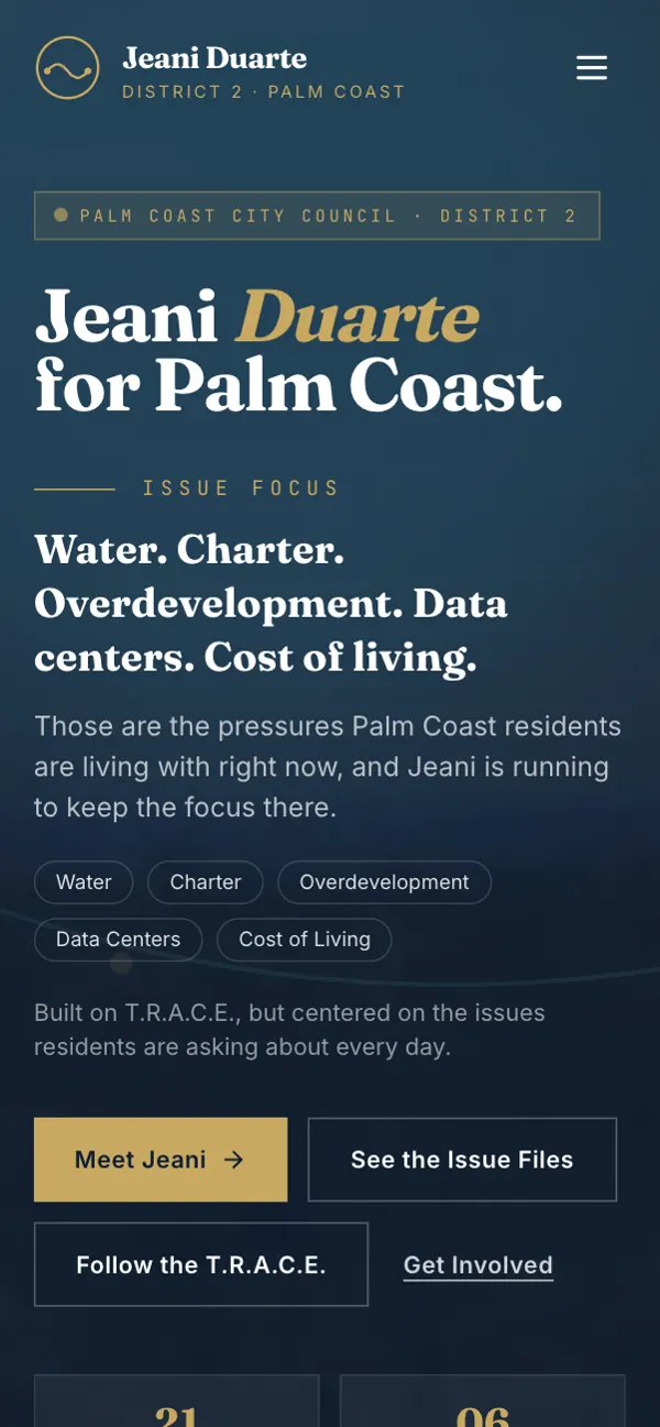
T.R.A.C.E. stands for Transparency, Responsibility, Accountability, Consistency and Ethical conduct. I turned it into a five-part section where each value gets a short, scannable line.
It gives the whole site a spine, so readers always know where they are.
- Five-value T.R.A.C.E. section
- Short, scannable value lines
- Consistent navy and gold styling
- Clear headline hierarchy
Light, coastal and steady
Navy, a soft gold and a Palm Coast teal keep the site calm and readable, which suits a page people skim between errands.
Every topic gets its own room.
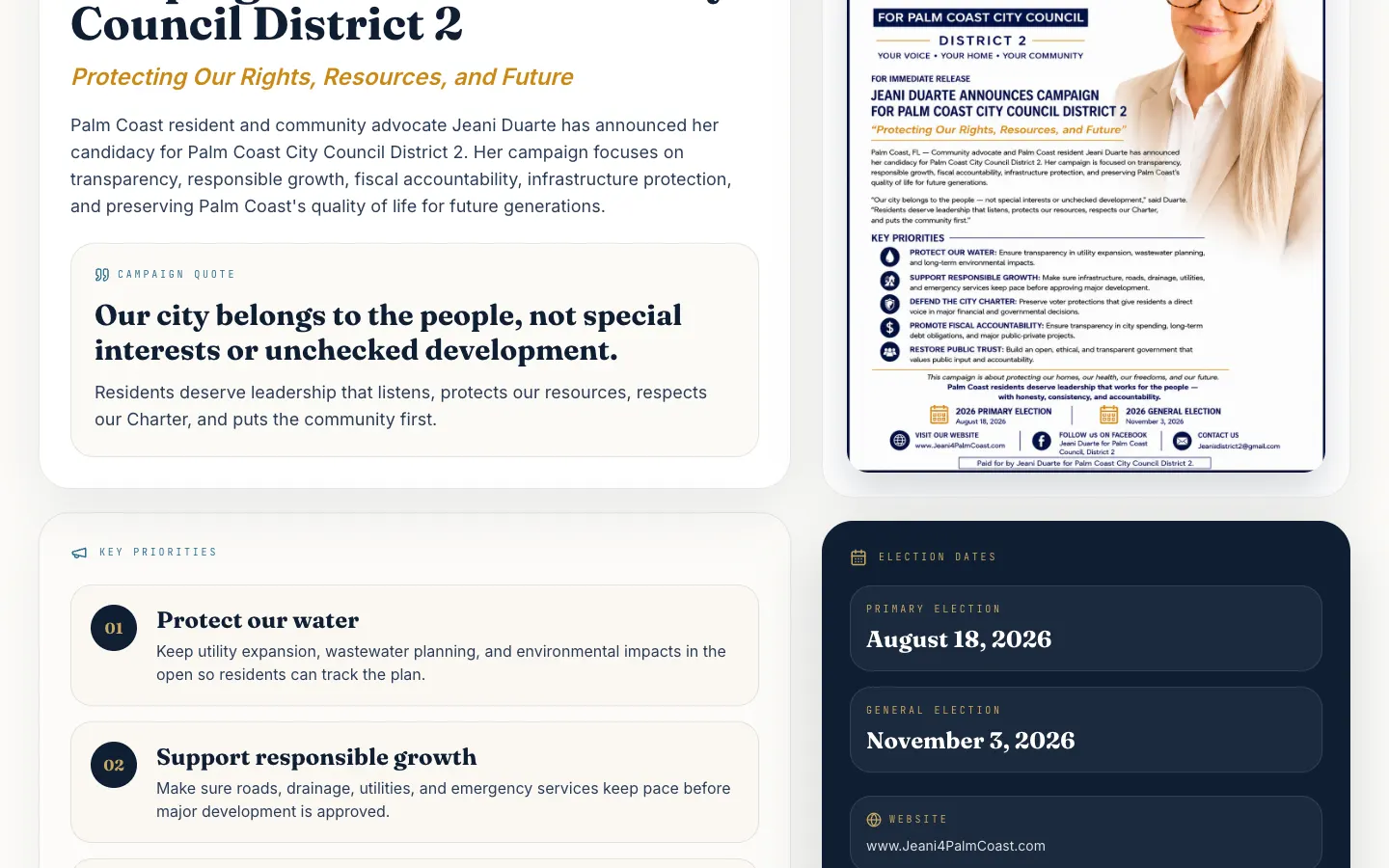
The campaign's local issues each got a dedicated deep-dive section, so readers can go straight to the one they care about without cards fighting for attention.
An about section introduces the candidate as a neighbor and small business background, written in the campaign's own words.
- Dedicated issue deep dives
- Candidate background section
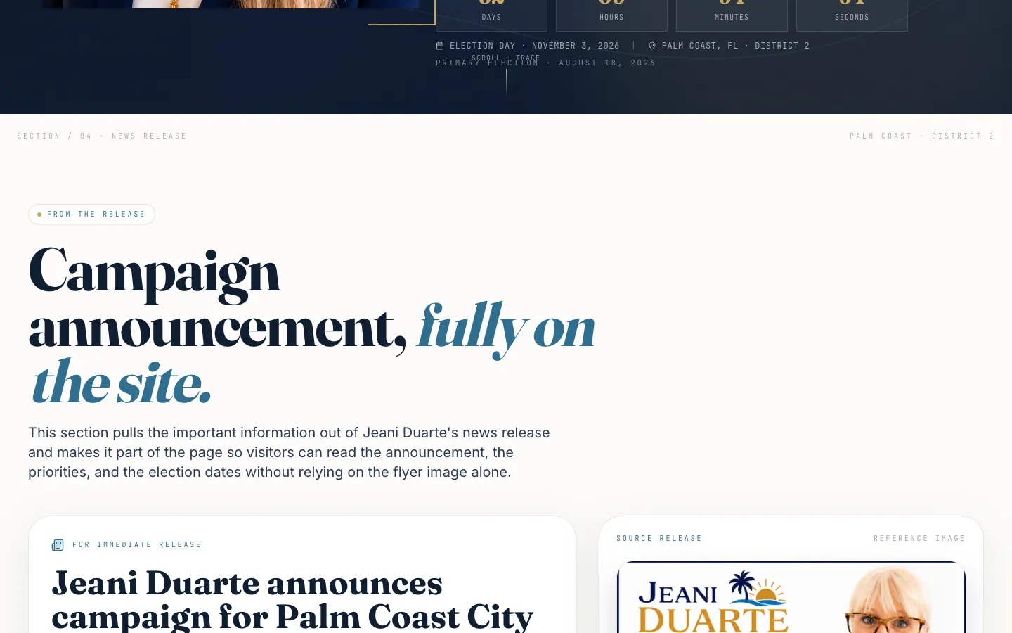
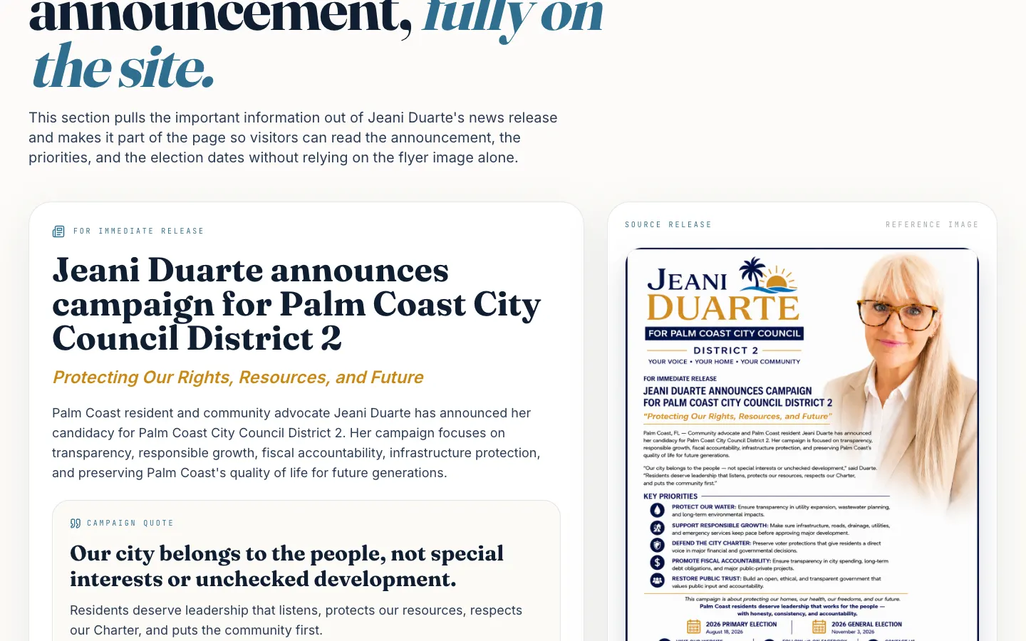
- Announcement and priorities section
- Mobile-friendly reading layout
Dates up front, volunteering one tap away.
The primary and general election dates sit right on the page, so nobody has to search for them. A volunteer button opens a ready-to-send message, and a contact form handles everything else.
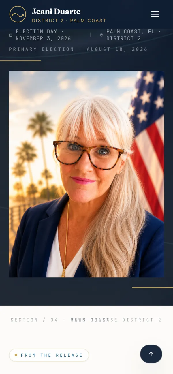
A designed share card with the candidate's portrait and the election dates makes every shared link do some work.
- Election dates on the page
- One-tap volunteer message
- Contact form
- 1200×630 share card
Built for the shared link.
Most visitors arrive from a text or a Facebook share. The issues stack into readable sections, the dates stay visible, and the volunteer button sits right where your thumb lands.
Five values, the issues and a way to help, all in a couple of scrolls.
The stuff you don’t see (but would miss).
Search-ready meta
A clear title, description and keywords built around the race and district.
Designed share card
A 1200×630 Open Graph and Twitter card with the portrait and election dates.
Form handling
Contact messages go through a form service straight to the campaign inbox.
Volunteer shortcut
A pre-written volunteer message opens in one tap.
Sitemap
A sitemap.xml so search engines find the issue sections.
Quick to update
A small admin area makes it simple to keep announcements current.
Before you ask me.
Do you build websites for local political campaigns?
Yes. I build the site and keep it neutral in design; the message and positions are the campaign's own.
How fast can a campaign site launch?
Campaign sites are usually small and focused, so they move quickly once the copy and photos are ready.
Can visitors sign up to volunteer from the site?
Yes. This build has a one-tap volunteer message plus a contact form.
Will the site look good when shared on social media?
Yes. It ships with a designed 1200×630 share card showing the candidate and the key dates.
Running for something local?
I build clean, readable campaign sites that let your message do the talking. Reach out and let's get yours ready before the yard signs go up.