Some sites sell. This one was here
to help.
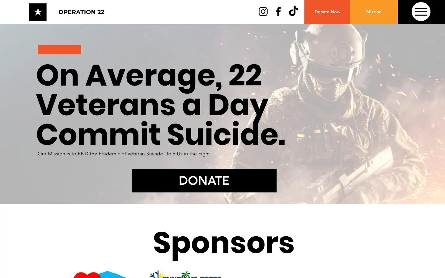
Operation 22 was a nonprofit dedicated to ending veteran suicide. The name comes from a heartbreaking average the organization put front and center. My job was simple to say and hard to get right: make it easy to give, easy to find help, and never feel like a sales page.
- 4core pages
- 1tap to donate
- 6Flagler veterans groups listed
A serious mission needs a steady voice.
This is not a topic for flashy animations or clever puns. The people landing here might be donors, sponsors, family members, or a veteran having a hard night.
So the design stayed calm and direct. Deep blue for steadiness, one red accent for urgency, and the mission statement right at the top in words nobody could misread.
“When the topic is this heavy, the design's job is to get out of the way and let people do something good.”
What it is, in one line: a calm, mission-first nonprofit site that made giving and finding veteran resources simple.
Help first, everything else second.
The Resources page gathered real, practical help in one place: national veteran assistance lines, service records help, and a list of local Flagler County veterans groups like the American Legion, AMVETS, DAV, VFW and the county Veteran Services office.
It's the page I cared about most. If one person found the right phone number there, the whole site earned its keep.
- National veteran assistance contacts
- Service records guidance
- Flagler County veterans groups
- County Veteran Services info
- Mental health resources list
If you or a veteran you love is struggling
Call or text 988 and press 1 to reach the Veterans Crisis Line, any time, day or night. You don't have to carry it alone.
Make donating almost effortless.
A Donate Now button lived in the main menu on every page and linked to a secure online donation form. No hunting, no five-step maze.
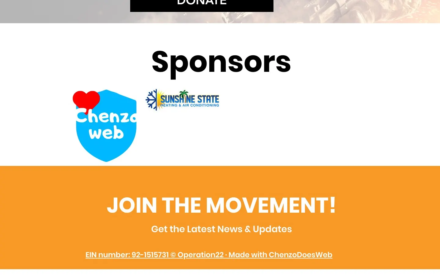
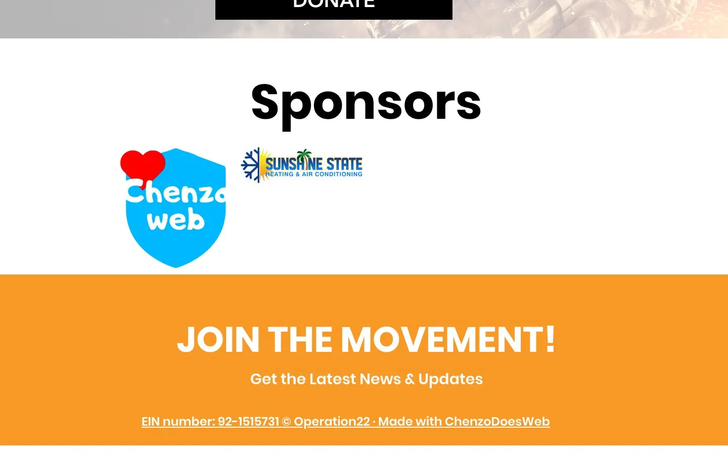
The organization's EIN sat right in the footer, a small detail that tells donors this is real and accountable.
- Donate button on every page
- Secure online donation form
- EIN shown for donor trust
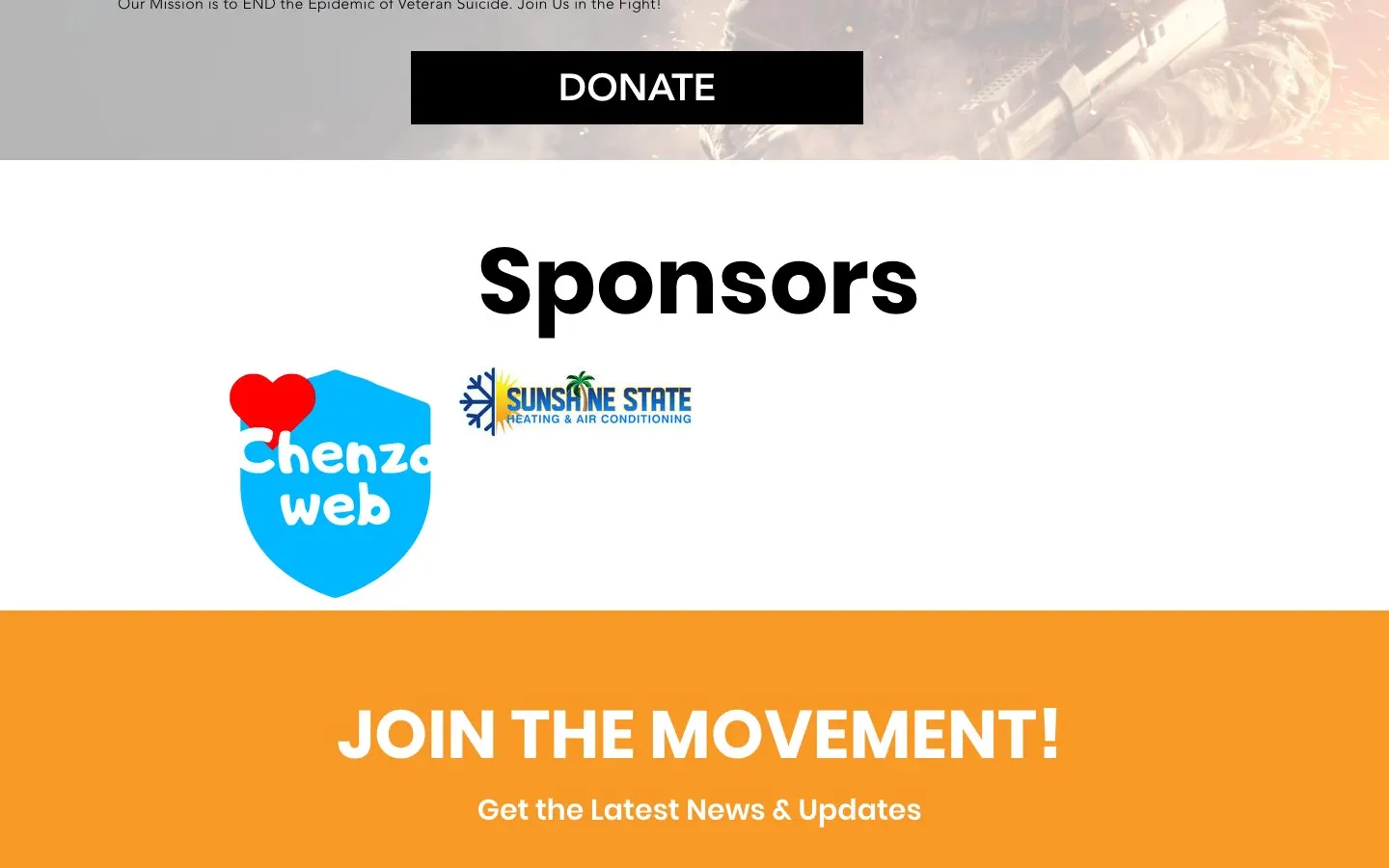
- Sponsors page to thank supporters
Turn awareness into a movement.
A Sponsors page gave local businesses a place to stand with the mission, and a newsletter signup invited people to join the movement and stay in the loop.
Social links to Facebook and Instagram kept the conversation going off the site too.
- Our Mission page
- Sponsors showcase
- Newsletter signup
- Facebook and Instagram links
Help should fit in your pocket.
A lot of people found Operation 22 from a Facebook post on their phone. The mobile menu kept Resources, Mission and Donate one tap away, and phone numbers on the resource list were easy to read and tap.
The stuff you don’t see (but would miss).
Mission-first homepage
The mission statement and a single clear call to action lead the page.
Secure donations
Giving ran through a dedicated, secure nonprofit donation form.
Resource directory
National and local veteran contacts organized on one easy page.
Newsletter capture
A simple signup to keep supporters updated on news and events.
Social share cards
Share images so posts linking to the site looked clean on social.
Mobile menu
A simple navigation that kept every key page one tap away on phones.
Before you ask me.
Is Operation 22 still active online?
The operation22.com domain is no longer live. This case study looks back at the site I built for the organization.
What should a nonprofit website include?
A clear mission, an easy donate button on every page, proof of legitimacy like an EIN, and a way to get involved. Operation 22 had all four.
How do you design for a sensitive topic?
Calm colors, plain words and no gimmicks. The focus stays on helping people take one meaningful action.
Can you add a donation form to a nonprofit site?
Yes. Operation 22 used a secure online donation form linked from every page, and I can set up something similar for your cause.
Building something that matters to you?
Nonprofits and causes get my full heart. Tell me about your mission and let's make it easy for people to show up for it.