
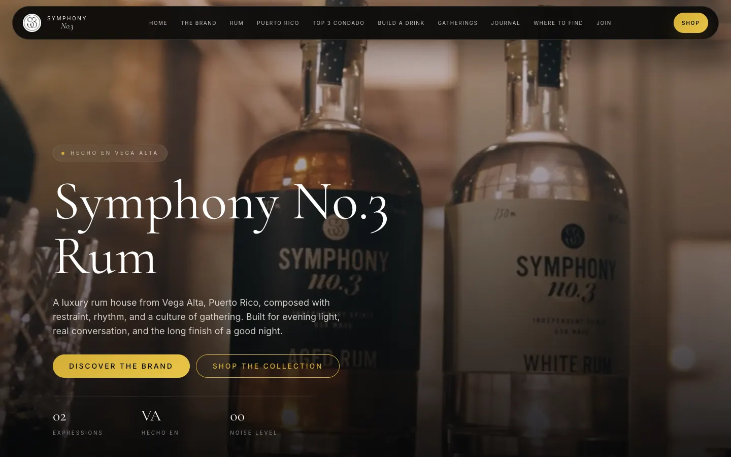
Pour slowly, scroll slowly.
Then buy a bottle.
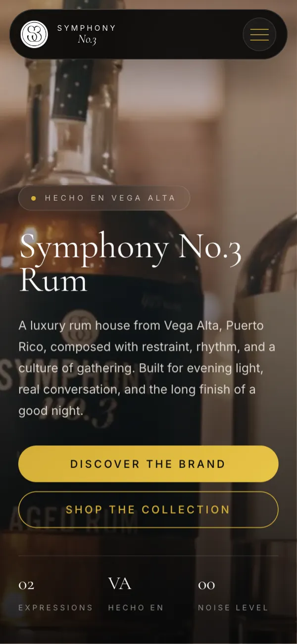
Symphony No. 3 is a luxury rum house from Vega Alta, Puerto Rico. The brand is all about rhythm, music and nights that run long, so the site had to feel like the first sip, not a spreadsheet of SKUs.
- 3expressions
- 21+age gate
- 1shared cart
- 2product pages
Luxury is mostly knowing when to stop.
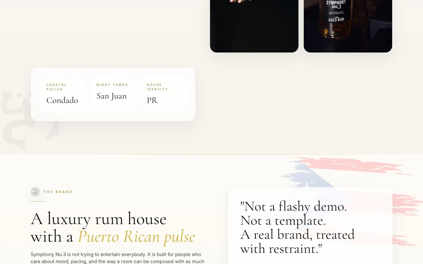
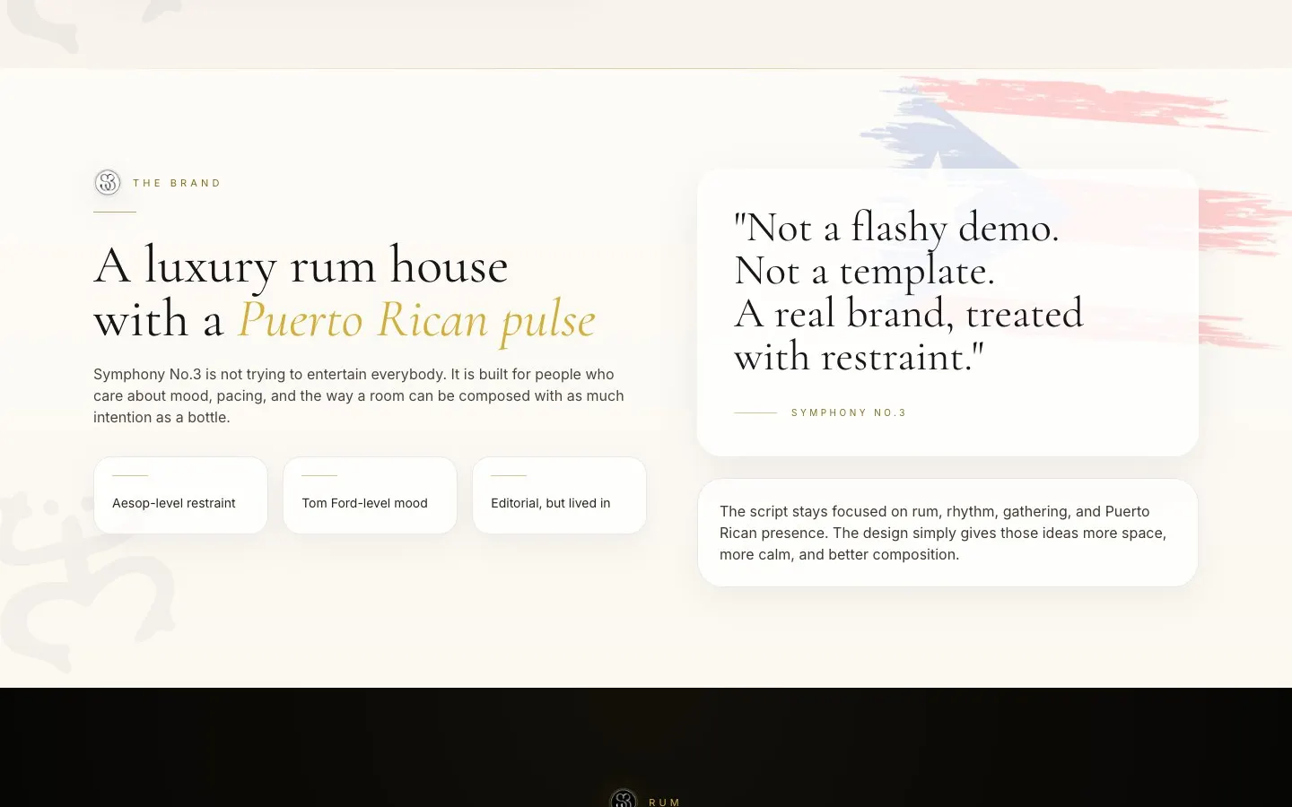
Spirits sites love to shout. Big gold letters, gold everything, a bottle spinning like a slot machine. Symphony's whole personality is restraint, so I went the other way.
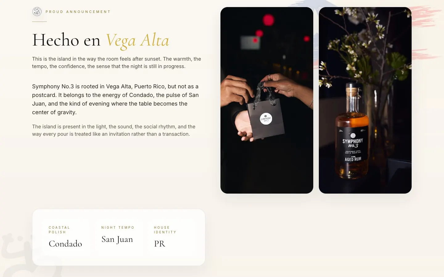
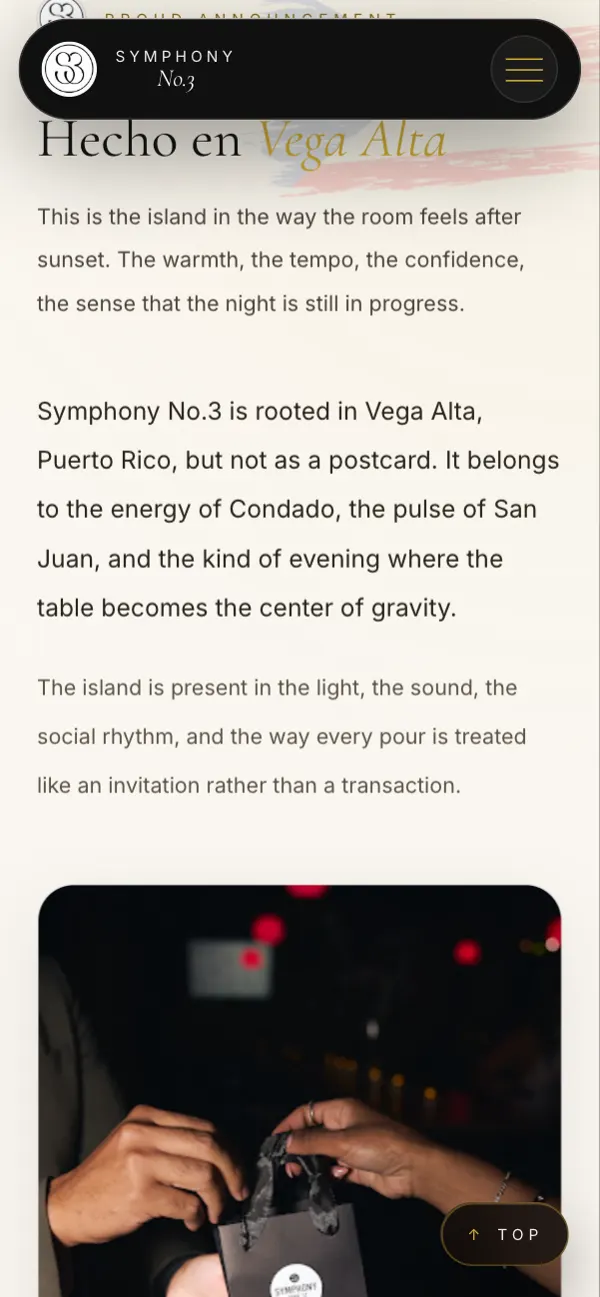
Black, warm cream and a single gold accent. Lots of room around the bottles. Copy that talks about Condado nights and Old San Juan evenings instead of 'premium quality ingredients.'
“I treated whitespace like the pause between notes. That pause is where the luxury lives.”
What it is, in one line: a moody, music-driven rum brand site where the shopping feels like part of the night out.
Every great bar has a velvet rope.
The age gate opens over a background video and asks visitors to confirm they're over 21 before they come in. It's a legal must, so I made it feel like an entrance instead of a hurdle.
Responsible drinking reminders show up throughout, quietly, the way they should.
- 21+ age verification
- Background video entrance
- Responsible drinking notes
- Hecho en Vega Alta branding
Music is part of the brand
The site gives Symphony's sound its own moment, because music isn't a garnish for this rum, it's the reason the room feels alive.
White, Aged and after dark.
Each expression gets its own personality. White Rum is crystal clear and precise, Aged Rum brings warm oak and caramel, and Dark Reserve is the moodier, smoky side of the house.
Tasting notes are short and sensory, plus serving ideas like On the Rocks, Highball and Golden Hour so people can picture the glass in their hand.
- Bottle-first product storytelling
- Dedicated White and Aged Rum pages
- Short sensory tasting notes
- Serving rituals
Mix and match in one cart.
One shared cart lets shoppers pick either bottle or add both, compare tasting notes and check out without bouncing between product pages. Simple on purpose.
A swipeable slideshow and an 'inner circle' signup round it out, so fans can stay close to the brand between bottles.
- One shared mix-and-match cart
- Compare notes before adding
- Swipeable photo slideshow
- Inner circle email signup
Built for the moment someone asks 'what are we drinking?'
Most bottle discoveries happen at a table, on a phone. The age gate, bottle pages and cart all work with one thumb, and the slideshow responds to a drag or a tap.
The stuff you don’t see (but would miss).
Age verification
A 21+ gate before anyone enters the store.
Embedded checkout
A secure buy button cart lets shoppers add bottles and check out right on the site.
Product routes
Clean, separate pages for White Rum and Aged Rum plus a dedicated shop.
Share cards
Designed social previews so links look premium when shared.
Email capture
An inner circle signup with a calm, no-spam promise.
Dark theme by design
A true dark palette with a gold accent tuned for low light and readability.
Before you ask me.
Do alcohol brand websites need an age gate?
Yes, they should verify visitors are of legal drinking age. Symphony's site asks visitors to confirm they're 21+ before entering.
Can a small spirits brand sell online from its own site?
Yes, where it's allowed. Symphony uses an embedded cart so shoppers can buy bottles right on the site.
How do you make a luxury brand site feel premium?
Restraint. A tight palette, lots of space, real product photography and copy about the experience instead of buzzwords.
Can customers buy more than one product at once?
Yes. Symphony's shared cart lets people add either rum or both before checking out.
Got a product people should crave?
Let's build a store that feels like your brand, not a template. Bring the bottle, I'll bring the mood.