

Lab coat clean, not lab
report boring.
Zentide Health sells research peptides to qualified researchers and providers. The brief: make a technical catalog feel modern and easy to browse, while keeping every compliance note exactly where it belongs.
- 1searchable catalog
- 1interactive quiz
- 1blog
Technical products need calm, clear design.
This is a category where trust is everything and clutter kills it. Long chemical names, dosing notes and research references can turn a page into a wall of text fast.
So I leaned into a deep navy, lab-light look with one bright cyan accent, tight typography and a structure that tells you exactly where you are.
“When the product names are long, the layout has to be short. Every page gets one job.”
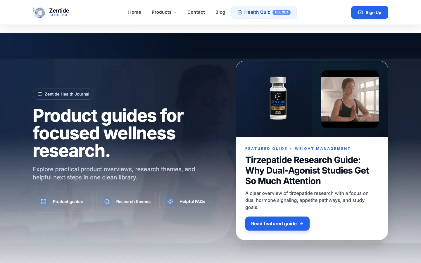
What it is, in one line: a modern, lab-inspired product catalog that keeps complex listings easy to browse and clearly labeled.
Find it fast, filter the rest.
The product catalog is built around browsing by category with search and filters, so people can narrow things down instead of scrolling forever. A clear-filters button saves anyone who gets too specific.
Every card is consistent: name, category, a short descriptor and a View Details button. Boring in the best way.
- Category browsing
- Search and filters
- Clear-filters reset
- Consistent product cards
- View All Products shortcut

Compliance in plain sight
Research-use-only and not-medical-advice language is designed into the product pages themselves, so it's never an afterthought.
Details up front, fine print visible.
Each product page lays out the compound, its category and research notes in plain sections, with a list of published references at the bottom.
Research-use-only and not-medical-advice notices appear right on the pages, not hidden in a footer. That clarity was non-negotiable.
- Structured product detail pages
- Published reference lists
- Research-use-only labeling
- Not-medical-advice notices
A quiz, a blog and a featured spotlight.
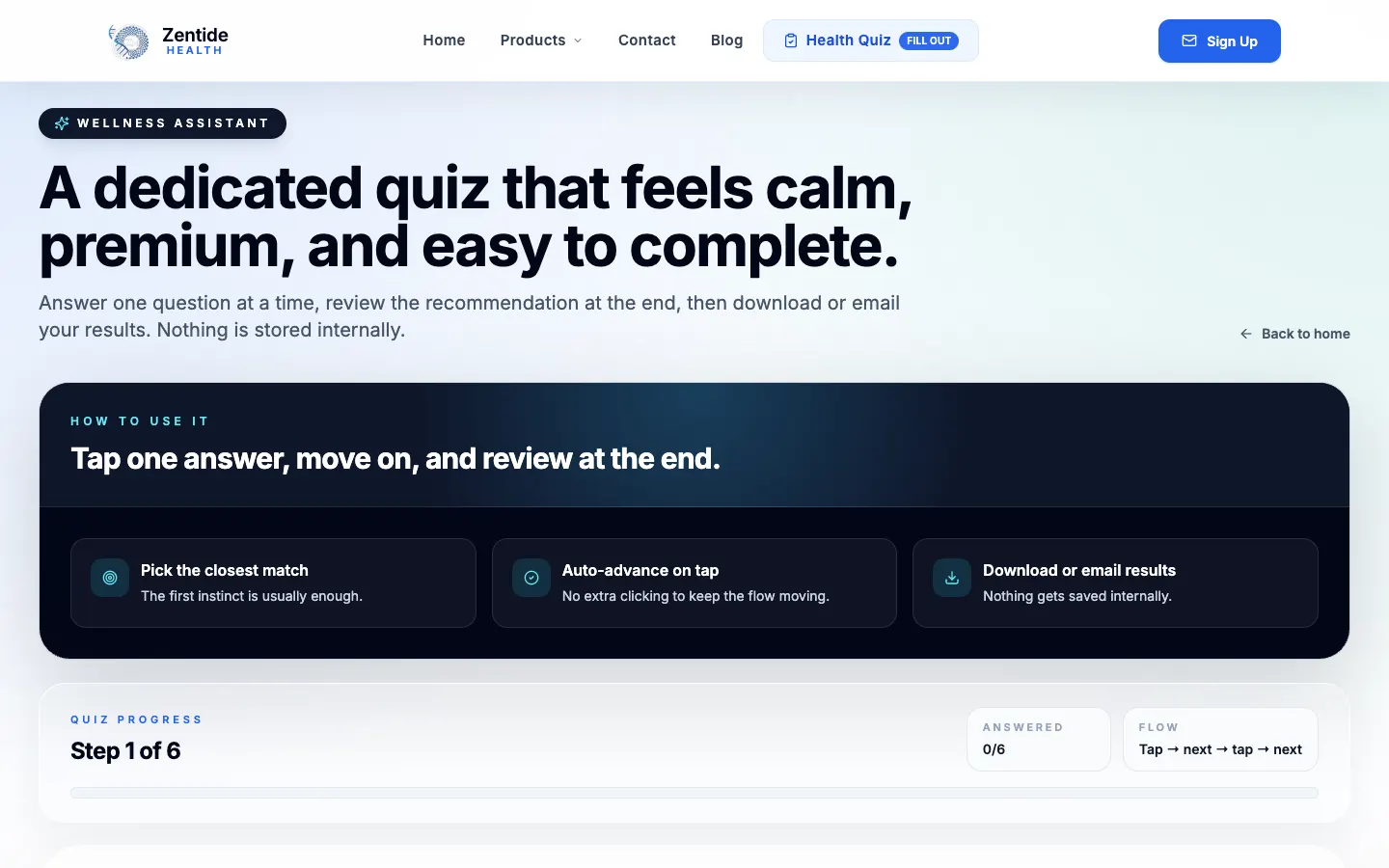
A featured product spotlight on the homepage gives the catalog a front window. An interactive quiz and a blog give visitors more ways to learn about the brand than just a product grid.
It all shares the same lab-clean look, so the site feels like one place.
- Featured product spotlight
- Interactive quiz
- Blog section
- Consistent lab-inspired styling
Long product names, short scrolls.
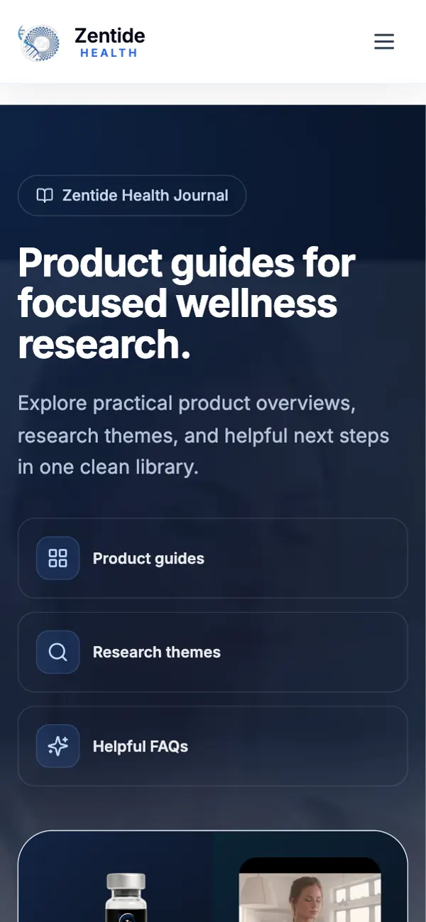
On phones the catalog collapses into a clean single column, filters tuck away until needed, and product pages break into short sections that are easy to read with one thumb.


The stuff you don’t see (but would miss).
Catalog filtering
Search and filter logic that narrows the catalog instantly.
Product templates
One detail-page layout keeps every listing consistent.
Compliance notices
Required disclaimers built into product templates.
Share cards
A custom social share image and Twitter card.
Blog and quiz routes
Separate pages for articles and the interactive quiz.
Fast single-page app
Instant page changes as people move through the catalog.
Before you ask me.
How do you make a complex product catalog easy to browse?
Categories, search, filters and consistent product cards. Zentide's catalog uses all four so visitors can narrow things down fast.
Where should compliance disclaimers go?
On the product pages themselves, not just the footer. Zentide shows research-use-only and not-medical-advice notices right on the listings.
Can a product site include references and research notes?
Yes. Zentide's product pages include structured notes and a list of published references.
Does the site work well on phones?
Yes. The catalog and product pages were built mobile-first with collapsible filters and short sections.
Selling something technical? Let's simplify it.
Complex catalogs are my kind of puzzle. Tell me what you sell and I'll make it easy to browse.